Seven High, Seven Low, And Seven Where We Just Don’t Know | Stat Geek Idol
March 15, 2012 - by Kevin Buikema
***IMPORTANT NOTE*** This is an entry in our inaugural Stat Geek Idol contest. The opinions and predictions expressed below do not represent the views of TeamRankings.com, and are solely those of the author. This article was conceived of and written by Kevin Buikema.
Generally, the first thought that comes to everyone’s mind the second the NCAA Tournament Selection Show ends is, “What in the world was the committee thinking?!”
To their credit, the committee has made a concerted effort, especially this year, to make the process as transparent as possible, going so far as to release the Nitty Gritty Report (a.k.a. 20 different ways to use the RPI) on the teams in PDF format, and even the actual S-Curve (rank of all teams 1-68) to the public on television.
That, of course, opens them up to all new forms of criticism. Thanks to the magic of digital video recording and the internet, the S-Curve is readily available online in several locations for analysis. What to analyze it against, though? Which rating is the most valuable, and will tell us the most useful data in comparison?
To that, I say, let’s just use all of them.
The Wisdom Of The Cloud
Thanks to Massey’s Rating Comparison, data is readily available on 51 separate rankings, from voter polls to predictive analysis to everyone’s favorite RPI.
Let’s start by seeing which of the ratings was the most accurate in terms of selecting the actual teams in the at-large field. The not-so-shocking answer, of course, is the RPI, which just by the rating selected 35 of the 37 at-large teams correctly, and the two out of range (Virginia, West Virginia) were among the next six in the rating. The RPI may just be a tool for selection, but going by the Nitty Gritty Report, it’s a tool used for every aspect of statistical analysis that goes on by the committee, and its fingerprints are on every single decision made.
“That’s great and all,” you may be thinking to yourself, “but tell me something I don’t know. How does this help me win my bracket pool?”
Well, thanks again to the committee, we can analyze the committee’s S-Curve in comparison to each of the ratings, except the polls, which only go to 25 and are objectively useless for analysis anyway. For this exercise, we’ll limit the analysis only to the at-large capable teams. Since Iona was the final team on the at-large board at 50, that includes the top 50 teams.
If we compare teams 1-50 on the S-Curve with where they fall among the 49 ratings, what does the aggregate data tell us?

7 Seeded Too Low
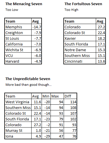
The first chart, there, on the upper left, indicates seven teams that were, on average, at least four spots better in each rating than they were on the S-Curve.
The real shame here is that four of the seven teams on the lsit are playing each other. Memphis, in particular, was on average a full three and a half seeds higher on each rating, as a seed line is equivalent to four S-Curve spots. Poor St. Louis, who is also underseeded by nearly two full seed lines. Instead of an 8-9 game, it should play more like a 5-7 game.
Similarly there’s Wichita State/VCU, where a VCU team that should be playing a 6 seed is playing a 4, and a Wichita State team that should be playing a 13 seed is playing an 11.
One more interesting note here: every team is in a mid-major…or the Pac-12, which played like a mid-major this year. No respect.
7 Seeded To High
Secondly, we have seven very fortuitous teams, headed by a Colorado team that had absolutely no business being rated among the at-large field. After that, there’s Colorado State, who’s probably still thanking their lucky RPI.
Interestingly enough, this field is dominated by Big East teams. Notre Dame, in particular, was the only team in the at-large field rated better in the S-Curve than they were in every single one of the other ratings, including the RPI.
These are teams whose opponents should be licking their chops, and of whom bracket prognosticators should be wary.
7 The Computers Can’t Agree On
Finally, there’s a chart that’s going to require a little extra explanation. Some teams had a lot of volatility among 49 ratings, where they varied wildly on both ends of the S-Curve spectrum. Most of them, however, varied wildly on the worse end. The Min value indicates the best rating the team had in comparison to the S-Curve, while the Max value indicates the worst.
The craziest team here was West Virginia, who though rated a 38 on the S-Curve, was rated anywhere from 18 to 132 among the 49 ratings on Massey’s comparison list. It’s difficult to get a reliable read on some of these teams, but many of them vary more on the negative side.
In conclusion, the many ratings available online allow the ability to get a pretty good aggregate analysis of the teams in the field. Plus, the new-found transparency of the NCAA Selection Committee makes this type of analysis now possible where in the past it was not.
Granted, a single game sample is never going to be the perfect result of analysis, but this should give bracket builders an idea of which teams are better than advertised, and which teams likely sent the committee some fruit baskets in the past few days.
Printed from TeamRankings.com - © 2005-2024 Team Rankings, LLC. All Rights Reserved.