Chart Of The Day: Visualizing 2012 NCAA Tournament Round Survival Odds
February 22, 2012 - by Gregory Matthews
[This guest post was conceived of and written by Gregory Matthews. Gregory received his Ph.D. in statistics from the University of Connecticut in 2011 and blogs at Stats In The Wild. His idols are Derek Kellogg and John Tukey. If you have an idea for a guest post that you think would fit right in here on our blog, please email us.]
With March Madness rapidly approaching, I’ve been poring over the the 2012 NCAA Tournament Bracket Odds, which provide, for each team, an estimated probability of reaching any given round of the tournament, based on recent bracket selection and seeding projections.
For example, they estimate that Murray State has a 14 percent chance to make it to the Sweet Sixteen and that Long Beach State has a 3 percent chance to reach the Final Four.
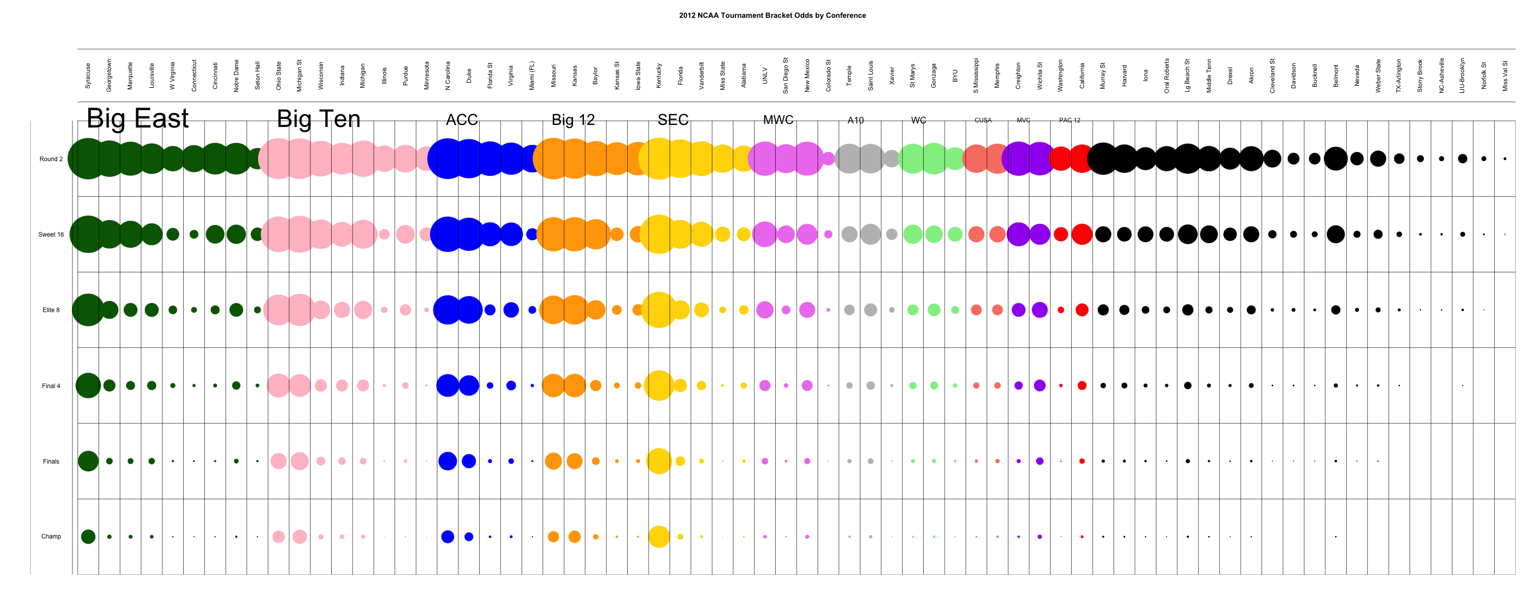
Providing this data for each team projected to make the tournament and for each round is certainly interesting, but it’s a lot of information for one brain to process. So I’ve decided to try to visualize the data and make it easier to consume all at once. To do this, I’ve made a so-called balloon plot:
2012 NCAA Tournament Bracket Odds Balloon Plot
(click to enlarge)

What Is A Balloon Plot?
The balloon plot here consists of 68 columns, one for each team projected to make it into the 2012 NCAA tournament, and 6 rows, each representing a round of the tournament (2nd round, Sweet Sixteen, Elite Eight, Final Four, championship game, and champion), which form a grid.
In each of the rectangles within the grid, a circle represents the probability of the team in that column advancing to the round in that row. The larger the circle, the larger the probability that that team advances to the given round.
The columns are then grouped by conference, and the conferences are ordered by the number of teams that are projected to qualify for the tournament.
Within a conference, teams are ordered by projected seed, with the highest seed on the left and lowest seed on the right. I’ve grouped all of the one team conferences into one group and ordered them by projected seed in the same way of the other conferences.
What Can We Learn From The Plot?
Many interesting things jump out at me from this chart, especially:
- Looking at the left of this chart, it is easy to see that college basketball is dominated by the Big East and Big Ten.
- While the Big East may qualify the most teams for the tournament, there seems to really only be one team in the conference, Syracuse, that will make a serious run at a title this year, whereas the Big Ten looks to be a deeper conference.
- Focusing on the conferences that qualified two teams each (Conference USA, Missouri Valley, and Pac 12), one can see that the Pac 12 is having an off year the ages. If the labels were removed from these three conferences, do you think you’d identify the red circles as representing the major conference? Probably not.
- The right side of the plot shows the one team conferences all represented as black circles and sorted by projected seed. What stands out to me over here is how out of place Belmont looks among the very bottom of the tournament teams. I pity the high seed that draws the Bruins in a first round matchup.
- Looking across the bottom row, one can see there are essentially eight teams that have a real legitimate shot at winning the national title with Kentucky leading the way. It’s also clear that the chances that a mid-major or small conference team will win it all are virtually nonexistent.
Printed from TeamRankings.com - © 2005-2024 Team Rankings, LLC. All Rights Reserved.