Bracket Genetics: Seeking The Winning Signature | Stat Geek Idol
March 19, 2012 - by Travis Gerke
***NOTE*** This is a winning Round of 64 entry in our inaugural Stat Geek Idol contest. This article was conceived of and written by Travis Gerke. The opinions or predictions expressed below do not represent the views of TeamRankings.com, and are solely those of the author.
A common aim for researchers in the field of genetics is to reduce overwhelmingly large and complex data sets to those components which contribute the most information. Often, data comes as expression levels for over 20,000 genes for each member of a group of people with some trait of interest. It is rare that one gene causes the trait under consideration; rather, some group acts in concert to drive the outcome. If the right group is found, one might call it a “gene signature.” Problematically, searching all possible groupings of even 200 genes would require the investigation of over 10^60 sets (yes, that’s a 1 with 60 trailing zeros), so even calculating the number of possible groupings of 20,000 genes would be computationally challenging!
Rather than exploring all possible variable combinations from the outset, one might instead build a so-called “heatmap,” which is a visible representation of the relationships among all variables included. Heatmaps seem to have a bit of magic in them. They combine incomprehensible amounts of data in such a way that the observer can discern meaningful patterns among the variables.
What does this have to do with the NCAA tournament?
Making An NCAA Tournament Heatmap
In the modern age of sports, fans are confronted by a barrage of statistics at every turn. With the inevitable rise of APBRmetrics (fancy wording for the statistical analysis of basketball), it would likely not be difficult to seek out 20,000 different measures of team or player performance. Since this now sounds a lot like genetics, an area where specific statistical tools like the heatmap are helping to propel new success stories daily, it seems natural to consider these same tools when filling out your office bracket.
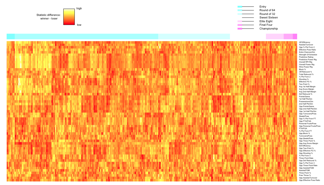
Below is a heatmap of 57 regular season variables compared among all teams that played in the NCAA tournament from 2007-2011. Columns represent games and are arranged by round of the tournament. Rows are team-level regular season statistics. Each pixel in the map represents the value for the winning team minus the value for the losing team in the tournament game in which they faced each other.
As an example, observe the bright yellow patch near the lop left corner. For any one of these variables, let’s say strength of schedule, this means that the winning team had a much higher strength of schedule in the regular season than the losing team. Since we are on the left side of the plot, this was a round 1 matchup.
(click to enlarge)
What Can We Learn From The Heatmap?
The first thing to notice is that 6 variables cluster very nicely across all games: strength of schedule, predictive rating, predictive power rating, overall RPI rating, overall power rating, and wins power rating. What this may imply is that we only need to consider one of these variables when filling out a bracket, since they all contain redundant information. That’s nice, right? Similar trends can be observed for other groups of variables.
In fact, when such trends occur together, we can harness this power. Consider the block of round 1 contests. We’ve already looked at the hot yellow spot in the upper left. This seems to happen when there is a red patch beneath for the variables opposing percent points from free-throws through opposing average score margin, meaning high strength of schedule and low opposing average score margin (for example) spell a winning combination.
Looking a few columns to the right, we see that when the winning team has a red patch where the yellow patch was, we have that the same block of variables below is now yellow. Thus, it appears helpful to simply look at the difference between these two variables to predict a winner. Moreover, if we can reduce the blocks of variables to a few that are representative, let’s say strength of schedule and low opposing average score margin, then we’ve really simplified things!
Having trouble choosing between Southern Mississippi and Kansas State in the upcoming match? Kansas State has a much higher strength of schedule and lower opposing average score margin. In other words, go with Kansas State — check the heatmap!
Printed from TeamRankings.com - © 2005-2024 Team Rankings, LLC. All Rights Reserved.
